
I would describe my relationship with the natural world as quite inconsequential- personally I find I have more fascination with man made structures- city skylines, ancient temples/castles, e.c.t. However I do feel like there is more beauty to natural landscapes then I currently see, in which I hope I will be able to see more throughout this project. If I were to go and see a landscape I would like to go to see any type of large body of water, with a range of rocks and grass surrounding- this in mind there are a few of these in England which I would be able to view.
I think people photograph natural landscapes as a reminder of the perfectly imperfect formations that have been there for a long time, unlike the urbanization a lot of people are constantly surrounded with. Usually I don't think photographs can change the way someone sees something, but that is not the case all the time.for example, when someone hears about a place with a certain reputation, or certain standards, a few photographs can show someone outside of that community that these standards or that reputation is simply not a true representation of the place.
I think people photograph natural landscapes as a reminder of the perfectly imperfect formations that have been there for a long time, unlike the urbanization a lot of people are constantly surrounded with. Usually I don't think photographs can change the way someone sees something, but that is not the case all the time.for example, when someone hears about a place with a certain reputation, or certain standards, a few photographs can show someone outside of that community that these standards or that reputation is simply not a true representation of the place.
What do we expect to see in a landscape image?
- What do you see in your mind's eye when you hear the word landscape?
- Make a list of the first 10-20 words that pop into your head. What words do we associate with landscape?
- Do a Google image search for the word landscape. What kinds of pictures appear?
- What would be your ideal landscape?
- Describe the landscape you see when you look outside (either from your classroom or bedroom).
- Have you ever taken a landscape picture? If so, what was it like and why did you take it?
- When I hear the word "landscape" I usually initially have the image of typical rolling green hills or a basic forest in my minds eye. However I am aware of the various captivating varied landscapes that can be present even only in the UK- lavender felids, glassy streams and jagged cliffs.
nature vibrant unpredictable weathered predictable monotone earthy odorous
alliance effervescent ruins uneven historic vast education
alliance effervescent ruins uneven historic vast education
- My "ideal"landscape would be a large glassy lake (a slow moving, passive body of water) with a range of large and small rocks, jagged and not to grassy. outside the lake would ideally be composed of rocky hills or low cliffs, covered with greenery.


the gallery above shows the pictures I took at school. I think generally my main focus was capturing clear simple frames of the trees, which takes up a lot of space in the area- the trees also act as a covering for the artificial structures in the back round. However because of the lack of variation in the landscape and very obvious presence of artificial, contrasting structures there was not a lot of interesting views to photograph. I also dislike the lack of disparity of color I think the green overpowers any other color included in the picture, including the blue. I have presented the pictures in this way as I photographed them at both portrait and landscape- which admittedly defeats the point of a "landscape". If they were presented all landscape they would be automatically cropped.
This video shows a continuous experiment of form, structure and mixed arrangements of landscape pictures, all natural landscapes, presenting a more specific theme. Lee proceeds to rearrange these ripped up pieces of picture, folding them and arranging them in a mixture of abstract ways- reusing old ones and intercepting new ones. This non- linear way of arrangement is quite repetitive, however by doing this Lee shows the wide range of collages that can be made from even a minimal amount of pictures in a variety of ways despite the clear improvised choices. I think despite the limited amount of interest I had in this video I will do an inspired activity, shown below.


Hiroshi Sugimoto


Sugimoto's blurred images in his architecture portfolio are quite interesting due to a few reasons. firstly, they all seem to have one or at most two objects (mostly buildings however as shown above can be frames of light) in the centre of the photograph, just being able to decipher these objects however being just blurry enough to almost give of quite an eerie ambience. This would mainly fall to the reason of the lack of colour in any pictures as well as the way he framed these objects to make them seem quite isolated, with not much of a back round other than a few clouds or street lights. Personally my favourite picture in this gallery would be the centre of the top row- for a few reasons. Starting off I like the object in focus (figuratively, not literally in terms of camera quality) which is what looks to be a mannequin. This is different from the others. It also appears to be in a corner of a room somewhere, which I think is representative of something. In conclusion the hint of humanity makes this my favourite one.


These out of focus landscape pictures are a result of using a blurry filter on a phone camera. looking at all of them I would say the picture that I like most is the one on the bridge showing back round buildings but having noticeably bright car lights in the foreground- also known as bokeh in Japanese- translating to "blur". I also find the simplicity and strong layering of the green, grassy land one interesting- the picture appear to be composed of 3 layers- pale grassland with patchy discolouration, then a row of large, dark green trees taking up the middle- the top most layer being a light blue and white sky. 6 of these photographs show
Ray K. Metzker- Pictus Interruptus
Metzker's pictus interruptus gallery consists of a range of images of textured surfaces, city scapes and landscapes interrupted by out of focus or in focus objects closer to the camera or bright shapes of light- usually in grey with no colour. These techniques create a new sub genre of street photography, with potential to contain many ideas.


My Pictus Interruptus


Google Glitches


A quick task of looking around on google maps for landscapes with the task of taking screenshots of landscapes- however the landscape must have something interrupting the picture- a shift in the picture, a random object in front, e.c.t.
Minimalist Landscapes
|
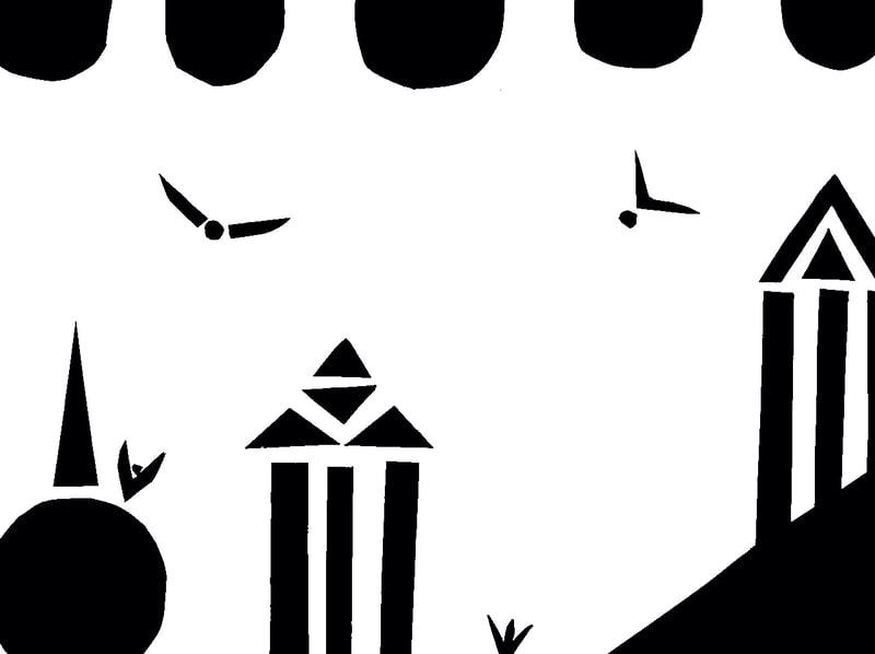
This is a minimalist landscape, inspired from Geraldo de Barros. I used the least amount of black paper possible while attempting to have enough elements to be mildly interesting- It is obviously an urban landscape a peers comment mentioned a resemblance of the well knows greek architecture from 6th century BCE to 9th century BCE., constructed of pillars and triangular tops. To slightly fill in the large amount of space, I introduced bird- resembling shapes, either flying or landing.
|

Geraldo De Barros is a Brazilian painter and photographer who, concerning his photography, was known for the abstract greyscale photographs he took and edited manually. This is a good example of this- this is a negative of a photograph, manually edited by cutting areas inside the tree and placing the subject against a black back round which further accentuates the more intricate details of the tree,
|
This picture is an example of a minimalist landscape by Liz Nielsen, "gardening with you". It is essentially a negative, with the black parts just deciphering objects typically found in natural landscapes- for example there is a bush, and a bin with some sort of gardening tool propped up against it. I find the rough, coherent shapes interesting as they obviously have not, in the making, required a lot of precision. Nielsen explains that during Covid- 19, access to facilities and resources were restricted, therefore a lot of her work pieces in that time period were similar to ones like this. The style is very similar to her other works, however one of the major factors (colour palette) was changed which drew attention to this style of work.

|

|
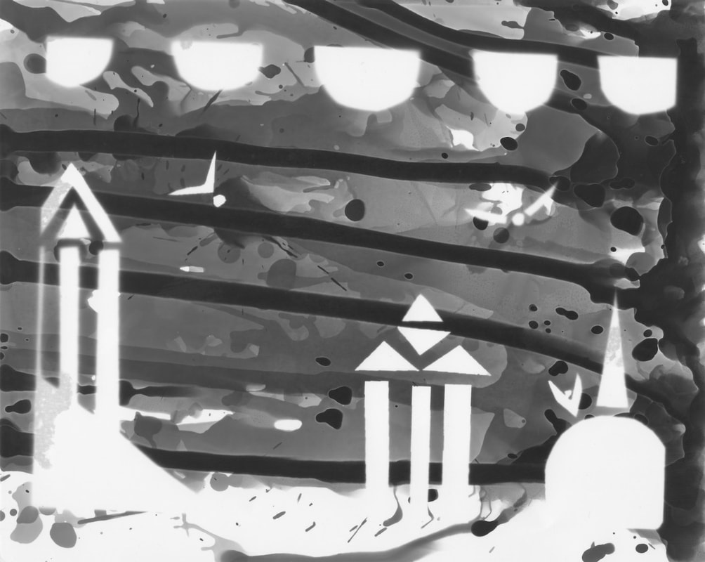
This is a negative of the minimalistic landscape I made using black card and white paper, using the least amount of card as possible- similar to Nielsen's "gardening with you". Secondly I used an enlarger, used to create photographic prints on the light sensitive paper which was underneath the original. After a certain amount of time, long enough to produce clear lines, the negative was placed in developer liquid, converting a latent image into a clearer picture. I then took the developing negative and used 3 more liquids, all part of the process of producing a clear negative- the stop, fix and wash. I think this one was successful due to the predominantly clear lines as well as the even black tone and its contrast with the white.
|
|
This is the second half of the task, the first half being from above- this is a manually edited version of the negative, and the simple action of dripping developer from the left side at an angle resulted in the somewhat abstract lines running across the image horizontally.Personally I prefer this edited version to the original for various reasons.
Firstly, I think the first one was too minimalist- barely any information serving as a reason for me to be interested in any way-there is more information to focus on here. Looking more precisely, I think the actual landscape has quite a different ambience- more turbulent, more descriptive of a chaotic climate, almost imitating some kind of storm. |
Artist Research
Fong Qi Wei- Wei is a Singaporean photographer who’s work intercepts technology and photography. Using digital pictures of cityscapes, he edits them to create and effect of a clear almost linear shape usually in the centre of the photograph with a gradient of a cool colour palette- green, blue and hints of yellow. They can be circles, stripes or it can just be a component of the whole back round. The intriguing choice of creating a time lapse out of it is what I am considering for the final project- the constant, rapid change of colour but more spread over different "layers" is better then a sudden complete change of colour.


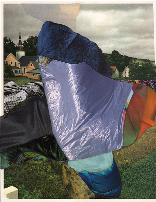
Liesl Pfeffer- This artist is known well for her collages of landscapes, involving textiles to capture the attention of viewers via the interesting patterns included in her work. The way the squares are presented almost creates the illusion of stairs, marking it as more unusual to normal landscapes- Pfeffer will mix greyscale parts with bright colours, circles, stripes as well as parts of other objects usually seen in natural landscapes like trees. There is quite clearly a lot of planning in terms of composition and measurements that go into this project, with some even being symmetrical in terms of shapes- not identical in colour or pattern.


Charles Wilkin- The reasons I chose to review this photographer are, again, mainly to do with the collage format. Similar to above Wilkin uses a range of textiles in his work- various materials like silky materials, basic bold coloured material, lace, plastic, e.c.t. The way he incorporates these materials are a distraction from the sometimes grey, sometimes colour back round landscape, and surprisingly go with the image in a way, not just placed on top randomly. The execution from this results in an attention capturing gallery.


An idea I have would be some kind of 3d sculpture- photographs and materials on paper cut into a way to become an interesting display , easily photographed- between gaps cut out there would be something else, like a repeat but in greyscale. some examples of what I might do
Brea Souders
Souders is a visual artist/photographer who makes pieces that represent the interception of manual art, photography and visual affects- which in turn appear more as experiments. Souders constructs mixed landscapes to make her work stand out more than others. A media that appears regularly in her work of this project is water colour which can easily be turned into shades and highlights, which is very beneficial considering the wanted effect in landscapes.


|
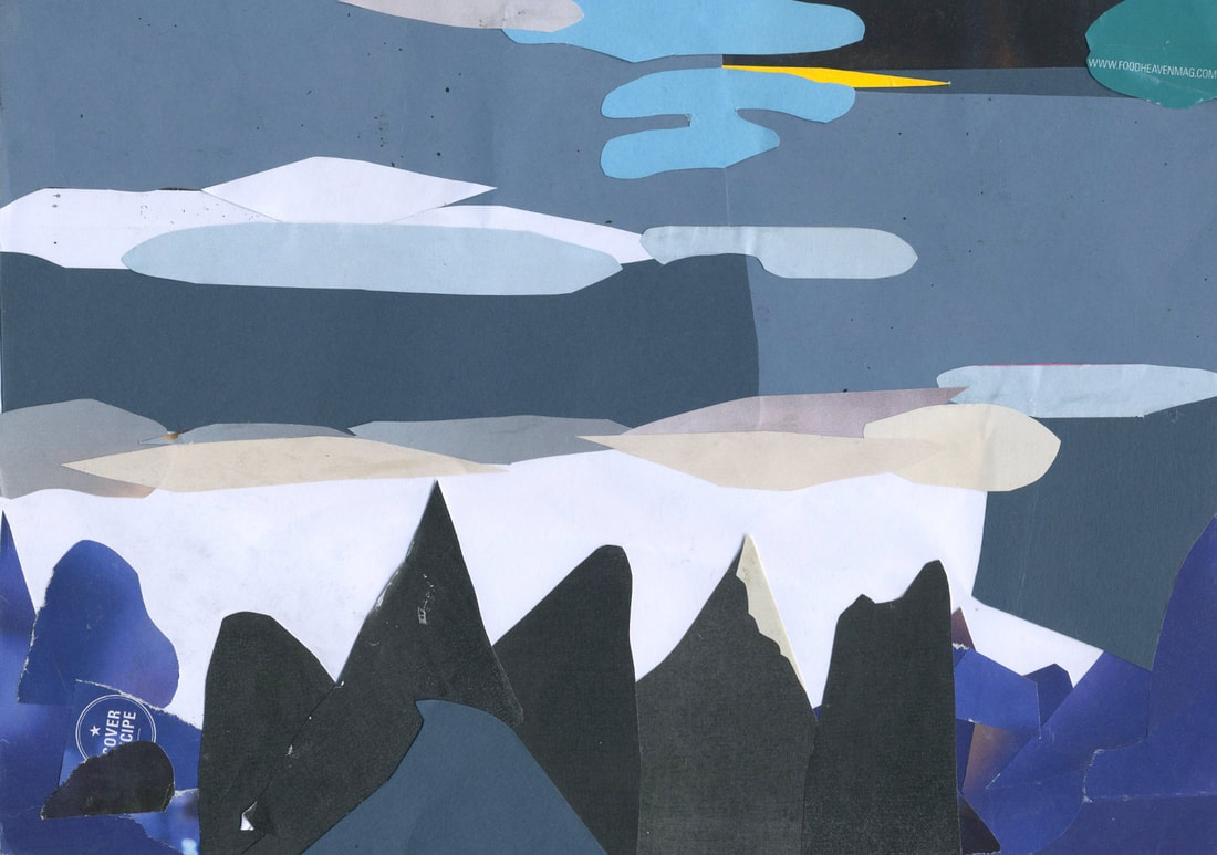
The image shown on the left is a picture of my collage I made with a mix of coloured paper and card, from either old books or magazines. It is supposed to look like a natural landscape, consisting of various mountains covered with snow against a dark back round, showing a night sky which explains the lack of colour variation and dark/black shades. I added a hint of yellow to show the presence of emerging daylight and created layers with the different types of paper mentioned above. I think it does look roughly how I wanted it to look- however there was a lack of paper shades and colours I would have preferred to use, which I think would have made it more visually interesting.
|
Photoshop digital collage experiments


Shown above are the several compositions I made on Photoshop made from a mixture of pictures from different tasks, layered and edited for some layers to be opaque, some colourless, some inverted. The whole project is quite abstract and consists of a mix of analogue and digital collaging.
Constructed Landscapes film
Finally, I decided to try to animate my digital collage using iMovie.
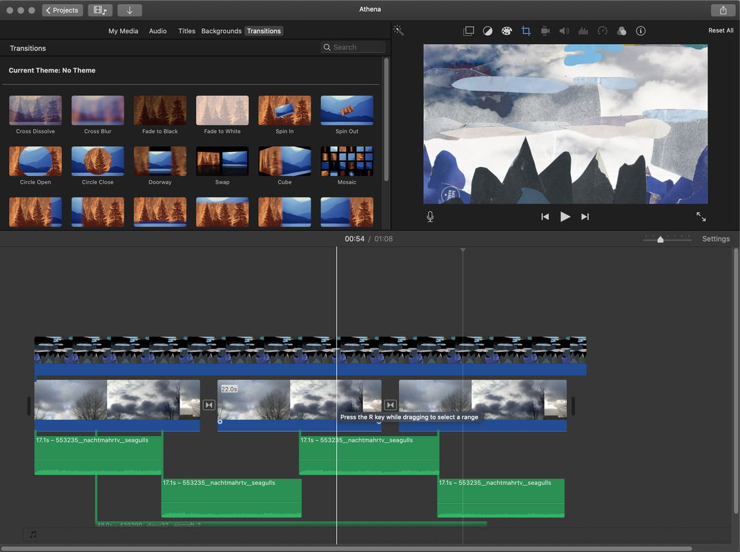
I added a soundtrack featuring seagulls and an aeroplane flying overhead to give the collage an atmosphere. I like the idea that the pictures and the sounds have both been collaged together to create a constructed landscape.
